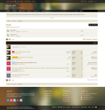
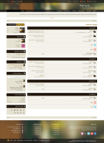
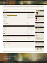
It seems that the cool colors do not fit with flat design anymore. However, the developer team has created this styles within that contrast inside. The menu with variation from deep green to lemon yellow brings to observers complicated feelings between freshness (lemon) and the over-maturity (deep green).
It could be more confused when you look at the overview of the picture, you could see that although text font and background are in contrast, they are still supporting each other in an amazing way. This leads to a crazy hit for any art lovers to take look. Might be its love at the first sight!


